Introduction
The Data Explorer is a data exploration tool with a customized public web interface that allows scientists, managers, and the general public to discover and access public data.
The Data Explorer has 3 major components:
Data Catalog
Data Map
Data Views
See the following sections of this help documentation for more information about each of these components:
Catalog Overview
The catalog provides searchable access to all datasets within the Data Explorer. The catalog can be used to discover, browse, and download data files.
Array Types
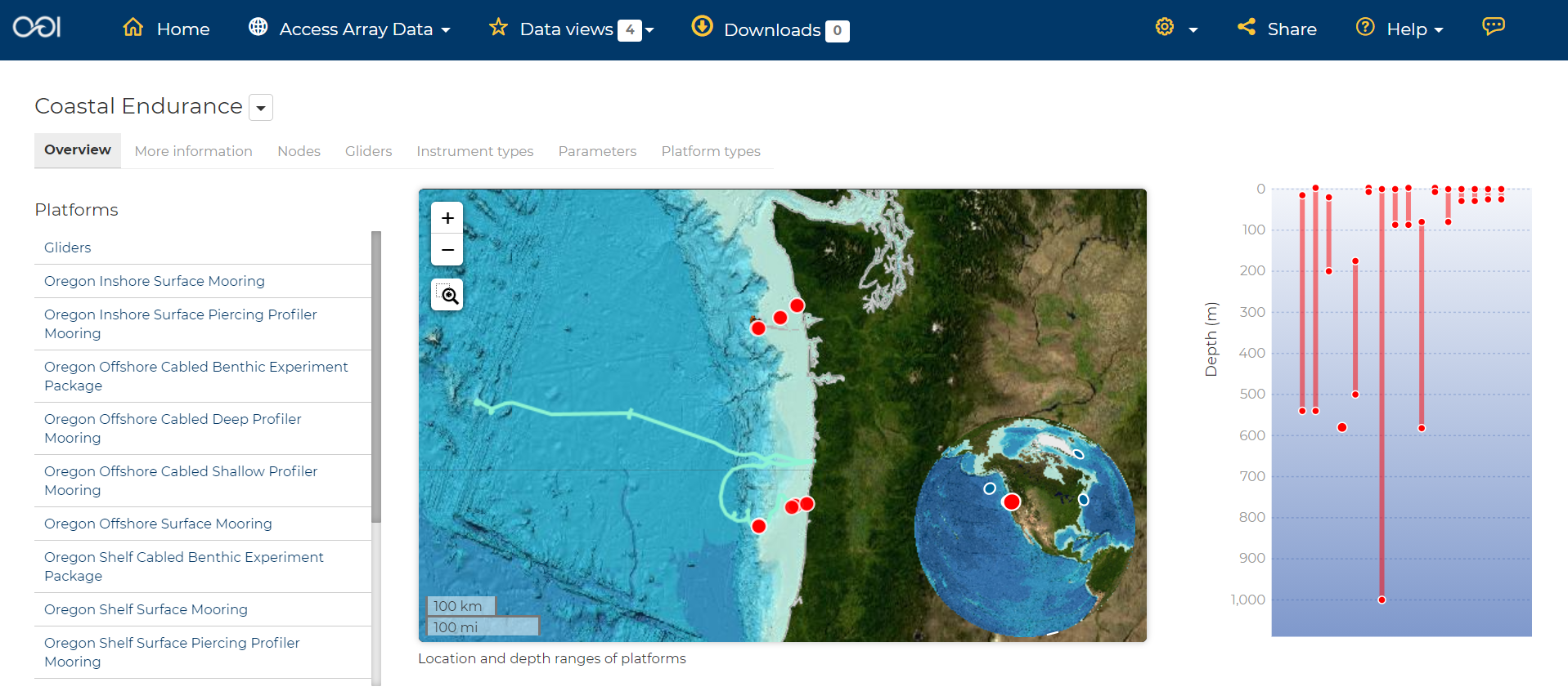
The Observatory consists of five arrays continuously collecting ocean data:
Regional Cabled Array submarine fiber optical cables that power three sub-arrays of seafloor instruments and instrumented moorings on the Juan de Fuca plate in the NE Pacific: the Cabled Axial Seamount, the Cabled Continental Margin, and the Cabled Endurance Array of Oregon.
Coastal Endurance Array moored arrays and autonomous vehicles off the coasts of Washington and Oregon.
Coastal Pioneer Array moored arrays and autonomous vehicles off the coast of New England.
Global Irminger Sea Array moored arrays and autonomous vehicles off the coast of Greenland.
Global Station Papa moored arrays and autonomous vehicles in the Gulf of Alaska.
Additionally, there are two historical arrays in the Southern Ocean.
Global Southern Ocean Array was located in the southwest of Chile was in place from February 2015-January 2020, when it was removed. Data from this array remain available for research.
Global Argentine Basin Array was located in the South Atlantic was in place from March 2015 – January 2018, when it was removed. Data from this array remain available for research.
The two coastal arrays expand existing observations off both U.S. coasts. A cabled array ‘wires’ a region in the Northeast Pacific Ocean with high-speed optical and high-power grid that powers data gathering and observation. And global components address planetary-scale changes using moored open-ocean infrastructure linked to shore via satellite. For further information about the arrays, click here.
Each of the arrays consists of both fixed and mobile platforms outfitted with scientific instrumentation. A surface mooring is an example of a stable, fixed platform. A profiler mooring, which has an instrumented component that moves up and down in the water column, and a glider, which is free to move in three dimensions, are examples of mobile platforms. OOI supports more than 80 platforms.
Each platform can contain multiple “nodes” that provide power and connectivity. Non-cabled nodes contain one or more computers and power converters, where cabled instruments are plugged in and their data are collected and transmitted to shore. The Regional Cabled Array has seven primary nodes that provide power and connectivity to the array, and also serve as distribution centers for extension cables that provide power and communication to sensors, instrument platforms, and moorings for continuous, real-time interactive science experiments at the seafloor and throughout the water column; select Chart Type Real-time streaming to view these Cabled Array data in real time. For further information about the OOI infrastructure, click here.
Arrays, platforms, nodes, and junction boxes provide the framework for instrumentation and sensors used to collect and transmit data to shore. More than 800 instruments are deployed on OOI, consisting of 36 different types, measuring more than 200 different ocean parameters. Each instrument is equipped with a sensor or multiple sensors that measure specific elements (parameters) of the environment. For further information about OOI instruments, click here.
Interface
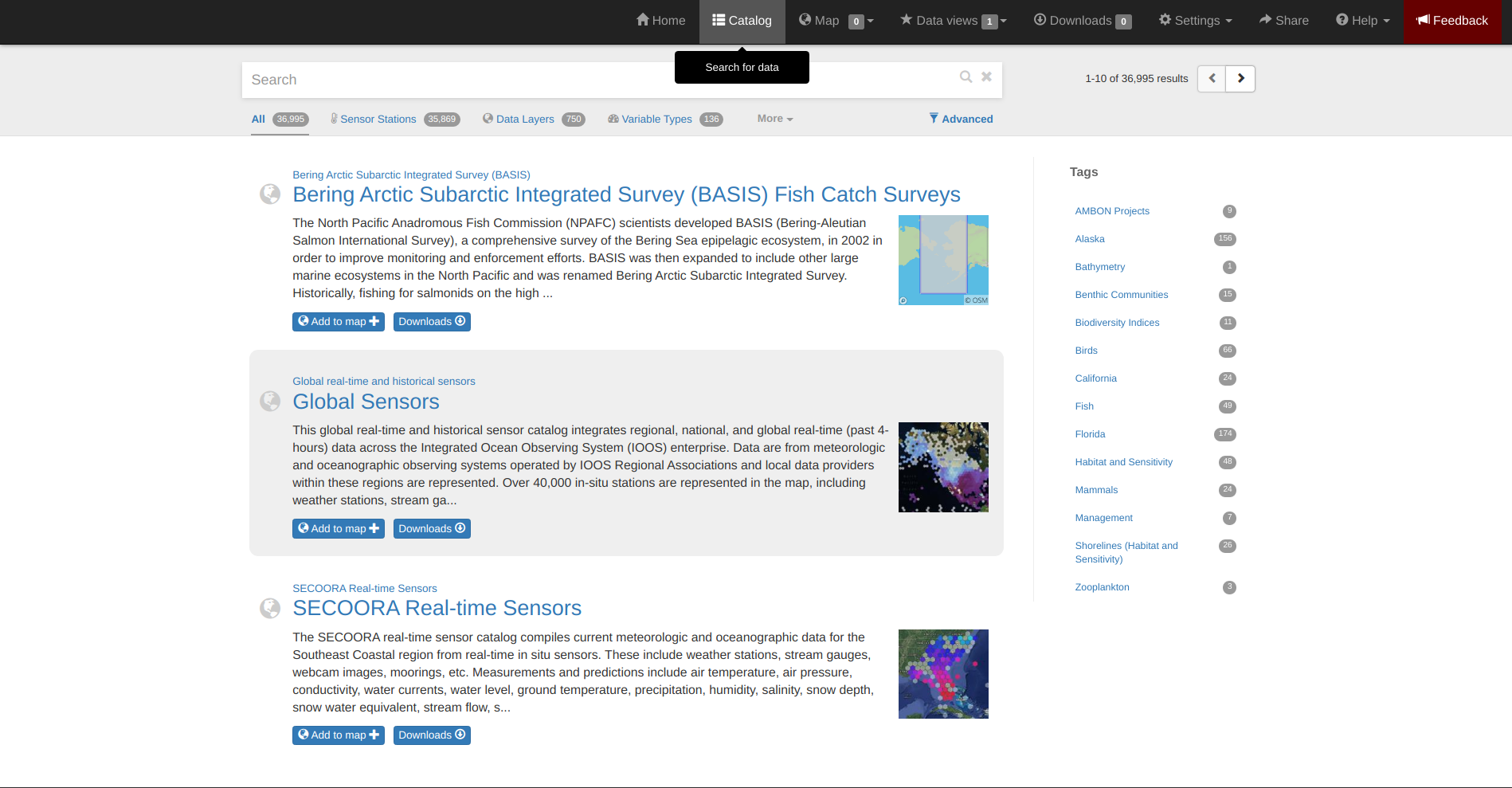
Within the catalog, you can browse or search all OOI instrument data organized by array, platform, node, instrument, or sensor parameter.By default, the data layers are shown in alphabetical order. The data catalog is built around a familiar search interface, with several important elements arranged around the screen:
Browse datasets by category (array, platform, node, glider, instrument, or parameter) in the upper tabs.
Filter by cascading result type in the column on the left.
View data charts in a grid display that match your search criteria in the center of the page.
Common Terms Defined
Common terms used to describe datasets are defined in the below table. More information about these terms can be found in the OOI Glossary.
Term |
Definition |
|---|---|
Array |
A regional component consisting of fixed and mobile platforms outfitted with scientific instrumentation. There are five active and two historical arrays. |
Platform |
A fixed or mobile device that is outfitted with scientific instrumentation. A surface mooring is an example of a stable, fixed platform. A profiler mooring and a glider are examples of mobile platforms. |
Node |
A node is a section of a platform that contains one or more computers and power converters. Instruments on a platform are plugged into a node, which collects the instrument data internally and/or transmit the data externally. Some platforms contain a single node, like a glider. Other platforms have several nodes wired together. For example, a mooring that hosts a surface buoy, near-surface instrument frame, and seafloor multi-function node, each with a different set of instruments attached. |
Cruise |
During each maintenance cruise, CTD casts are performed prior to deployment and following recovery of most OOI assets (glider deployments may involve a single reference CTD cast). Water samples are collected in Niskin bottles at multiple depths and analyzed. |
Instrument types |
A scientific instrument is a piece of specialized equipment used to sample oceanographic attributes and collect data. There are 36 unique models of specialized instrumentation used throughout the OOI. |
Parameter |
The type of value measured by the instrument (e.g. temperature, pressure). |
Platform types |
A custom grouping of instrument types to differentiate whether they are cabled, moored, or mobile, or the general location in the water column (near surface, profiling, or seafloor). |
Data Charts
The catalog and map offer multiple ways of comparing data within both the mapped interface and within a Data Views.
Data Grid Display
The results that match your search criteria will be shown as in a gridded display of data charts in the center of the page.
There are many options for interacting with the data in this display:
Advanced search options in the center toolbar (Spatial filter, Filter time filter, Keyword search, Depth filter). Refer to Advanced Search Filters.
Browse detailed information about datasets using the Inventory, Download, Annotations, Deployment, and More Information tabs. Refer to Metadata.
Download one or more datasets using the green Download button. Refer to Downloading.
Expand the individual data charts to customize the chart, including changing the chart type, adjusting the time scale and binning, viewing the data quality flags, and learning more information about the individual instrument deployment and annotations. Refer to Customize Data Charts.
Different Chart Types
This section includes descriptions for the common charts used to display data. Data charts can be accessed both by clicking a data chart, or by using the custom Data Views interface. For more details, please see the Customize Data Charts page.
Categorical Variables
Bar charts: compare the size or frequency of different categories. Since the values of a categorical variable are labels for the categories, the distribution of a categorical variable gives either the count or the percent of individuals falling into each category.
Quantitative Variables
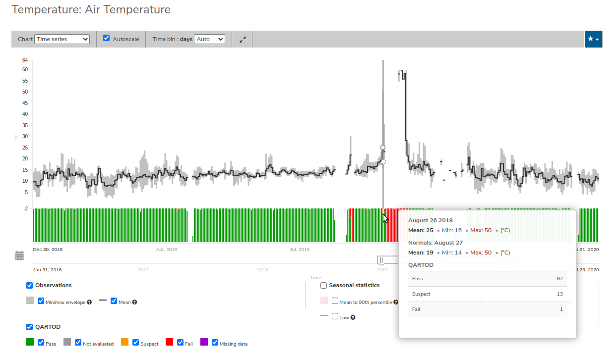
Line Charts: display points connecting the data to show a continuous change over time. In the map, the line chart shows the current values together with historical statistics. The x-axis shows the occurrences and the categories being compared over time and the y-axis represents the scale, which is a set of numbers organized into equal intervals.
Histograms: show the frequency of distribution for the observations. A histogram is constructed by representing the measurements or observations that are grouped on a horizontal scale, the interval frequencies on a vertical scale, and drawing rectangles whose bases equal the class intervals and whose heights are determined by the corresponding class frequencies.
Box plots: are useful for identifying outliers and for comparing distributions. The boxplot is a graph of a five-number summary: the minimum score, first quartile (Q1-the median of the lower half of all scores), the median, third quartile (Q3-the median of the upper half of all scores), and the maximum score. The boxplot consists of a rectangular box, which represents the middle half of all scores (between Q1 and Q3). Approximately one-fourth of the values should fall between the minimum and Q1, and approximately one-fourth should fall between Q3 and the maximum. A line in the box marks the median. Lines called whiskers extend from the box out to the minimum and maximum scores.
Dot plots: consist of data points plotted on a fairly simple scale. Dot plots are suitable for small to moderate sized data sets to highlight clusters and gaps, as well as outliers. When dealing with larger data sets (around 20–30 or more data points) the box plot or histogram may be more efficient, as dot plots may become too cluttered after this point.
Curtain plots: show a visual summary of vertical profiling data. If data is available at depth, the chart will show depth on the y-axis with the values represented by colors.
Real-time Streaming
Real-time streaming: Line charts displaying real-time streaming are available for some Cabled Array data. Real-time data are displayed in two panels, with the upper panel zoomed into the real-time streaming data and the lower panel displaying the past 24 hours.These charts cannot be customized, and this chart type does not include Download. To access the most recent data for download, click on the “Data” tab to open the regular Data chart.
Climatology and Anomaly Charts
If there are more than three years of data coverage, charts show statistics from past weather patterns along with the current data. These are not officially climatologies, which typically require 30 years of data, but they can still be useful to quickly compare how the current year compares to the long-term average.
Observational Statistics
By default, if there are too many observations to easily show on the time-series, the observations binned by default for display. Graphs may show the following:
Mean: The mean line represents the average value of all observations within each time bin.
Min/max envelope: The envelope represents the extent of observations within each time bin.
Interannual Statistics
Interannual statistics are calculated on physical time-series where available data coverage in the system is longer than three years. Statistics are derived for days, weeks, months, seasons, and years based on the Gregorian calendar by:
binning the observations into the selected time periods,
combining the time bins across years (e.g, for daily bins, combining all data from April 13th regardless of year; for monthly bins, combine all data from all Aprils), and
calculating statistics for each interannual time bin.
For interannual statistics, we calculate the following:
Mean: The mean represents the average value of all observations within each time bin, across all recorded years.
Low: The low represents the minimum value of all observations within each time bin, across all recorded years.
High: The high represents the maximum value of all observations within each time bin, across years.
Mean to 10%, Mean to 90%: Percentiles are calculated by ordering all values in the time bin across all recorded years and selecting the value at the 10% and 90% locations in the array (i.e., the shaded percentile region relays what the typical temperature is at that time of year excluding the 10% most extreme values on either end of the distribution).
Anomaly Plots
Anomalies are available wherever interannual statistics are available (i.e., in all time-series where available data coverage in the system is longer than three years, but are only available on data binned on days or more).
Anomalies are calculated by calculating the mean value of the observational bin and subtracting the interannual statistical bin for that time period. For example, the daily anomaly for April 13th, 2016 is calculated by taking the average temperature for that day minus the mean interannual April 13th temperature.
Customize Data Charts
The table below contains a key to several of the important terms used in describing the Data Explorer’s chart capabilities:
Term |
Description |
|---|---|
Minimum |
The minimum value of the entire time-series within each bin, represented by a dashed blue line. |
Mean to the 10th percentile |
The range from the mean to the 10th percentile of the data is represented by a blue shaded area. |
Mean |
The mean of the entire time-series within each bin, represented by a dashed gray line. |
Mean to the 90th percentile |
The range from the mean to the 90th percentile of the data is represented by a red shaded area. |
Maximum |
The maximum value of the entire time-series within each bin is represented by a dashed red line. |
Line chart |
A chart of the current values with historical statistics. |
Climatology |
Year-to-date monthly mean values of the current year compared to historical statistics. |
Anomaly |
The data values minus the mean values across all years. |
Curtain |
If data is available at depth, the chart will show depth on the y-axis with the values represented by colors. |
Time Bins
Data can be binned across years within the following time periods:
Time period |
Definition |
|---|---|
All |
No binning. |
Hours |
Data are binned by hour and daily statistic are displayed (see below). |
Days |
Data are binned by day and statistics are by day number across years. |
Weeks |
Data are binned by week, and statistics are by week number across years. |
Months |
Data are binned by month, and statistics are by month number across years. |
Seasons |
Data are binned by northern hemisphere seasons defined as the following:
|
Years |
Data are binned by years, and statistics are across years. |
Note
Percentiles are calculated by ordering all values in the time bin across all recorded years and selecting the value at the 10% and 90% locations in the array. I.e., the shaded percentile region is telling you what the typical temperature is at that time of year excluding the 10% most extreme values on either end.
For more information on how to customize charts, refer to the Customize Data Charts section.
Data Products
Through the Data Explorer, data products are processed at various levels for download and visual exploration.
Data Product Levels:
Instrument deployment (Level 1): Unprocessed, parsed data parameter that is in instrument/sensor units and resolution. A deployment is the act of putting infrastructure in the water, or the length of time between a platform going in the water and being recovered and brought back to shore.There are multiple deployment files per instrument. Refer to Deployments section.
Time series (Level 1+): This time series is created by merging recovered and telemetered streams for un-cabled instrument deployments (see example illustration below). For high-temporal resolution data, this product is binned to 1-minute resolution to allow for efficient visualization and downloads. This is the primary product for visualization within the Data Explorer.
Full-resolution time series (Level 2): Full-resolution datasets are provided without temporal binning in a series of ‘gold copy’ netCDF files organized by instrument stream and deployment. You may need to concatenate deployments. Full-resolution datasets may contain more variables than have been visualized in the Data Explorer.For best performance, THREDDS is recommended for data download of full-resolution data. Refer to Data Download Section.
Metadata
The metadata contain all the key knowledge about the data record (e.g., time of collection, location of collection, unique source and record description identifier, platform identification, etc.), to enable it to be understood by the system and its users. Any data that OOI collects are associated with appropriate metadata. OOI metadata follows the CF 1.6 standard, with additional metadata types and fields specific to OOI as necessary. The metadata can be found in the header of downloaded NetCDF files as well as in the Asset Management tables of the OOINet data portal. Additionally, ISO-compliant versions of the metadata can be accessed via the OOI ERRDAP server , which is available under Downloads. Refer to Metadata section for more.
More Information
In addition to metadata, contextual information about the instrumentation may be found under the More Information tab. This may include information such as: instrument location, deployment depth, technical specifications, calibration, and instrument photos or diagrams.
Annotations
Annotations are the primary means of communication between the instrument data team (aka ‘data provider’) and end users. Annotations are entered alongside the data by the data provider. Annotations for the instrument are available at the node, instrument, and data stream levels. Annotation time ranges and text summaries are shown in the data charts. In addition, annotation text appears under Annotations in the center toolbar, where they can be downloaded as a CSV file. Refer to Annotations section for more.
Deployments
A deployment is the act of putting infrastructure in the water, or the length of time between a platform going in the water and being recovered and brought back to shore.The full-instrument time series data shown in the Data Explorer data charts are created by joining recovered and telemetered streams for non-cabled instrument deployments. Refer to the Data Products section. The deployment time ranges are shown graphically and in a tabular view for exploration and download. Refer to Deployments for more.
Download Data
In addition to visualizing a dataset you can download datasets by clicking the download button ![]() and selecting among the options in the popup window. Data files may be accessed using interoperability services (i.e. ERDDAP, THREDDS), downloaded individually in different file formats, or bundled for download using the Download Queue. See below for more information about data format.
and selecting among the options in the popup window. Data files may be accessed using interoperability services (i.e. ERDDAP, THREDDS), downloaded individually in different file formats, or bundled for download using the Download Queue. See below for more information about data format.
Data Formats
There are several ways to download gridded data from the Data Explorer:
THREDDS
NetCDF Subset
ERDDAP
THREDDS
Thematic Realtime Environmental Distributed Data Services (THREDDS) is a set of services provided by Unidata that allows for machine and human access to raster data stored in NetCDF formats. THREDDS provides spatial, vertical, and temporal subsetting, as well as the ability to select individual dimension or data variables to reduce file transfer sizes. The most commonly used THREDDS services for users are NetCDF Subset, and Open-source Project for a Network Data Access Protocol (OpenDAP).
Note
All THREDDS servers have a bandwidth limit, and it will not allow you to download more than the cap in one go. So you won’t be able to download 1 Tb of data with a single request. If you need a lot of data, you will need to break up your requests to download the dataset incrementally (e.g., one month at a time; one variable at a time, etc.). If you’re grabbing a lot of data programmatically, sometimes it’s easiest to grab just one time slice at a time using a loop.
NetCDF Subset
The NetCDF Subset protocol looks through all the datasets NetCDF files stored on our server, and provides an human-readable or machine-readable interface to subset the data by time, geography, or variable. For more information, please see the Download Using NetCDF page.
Tip
When you initially request a dataset via NetCDF Subset, the server may take a long time to respond if the dataset is large (i.e., thousands of files). Be patient, it’s not broken! If your web browser times out (e.g., after 10 minutes of waiting), you can try reloading or just giving it a few more minutes and then reload. This won’t restart the server process, and once it’s indexed all the files things will go pretty fast.
ERDDAP
The ERDDAP (National Ocean and Atmospheric Administration’s Environmental Research Division’s Data Access Program) Server is a free and open-source Java “servlet” that converts and serves a variety of scientific datasets using common file formats. ERDDAP gives you a simple, consistent way to download subsets of datasets in common file formats, in addition to making graphs and maps. All information about every ERDAPP request is contained in the URL of each request, which makes it easy to automate searching for and using data in other applications. Proficient users can build their own custom interfaces. Many organizations (including NOAA, NASA, and USGS) run ERDDAP servers to serve their data. Because of its widespread use and accessibility, the ERDDAP principal developer and user community have created user guides, instruction videos, and code examples to facilitate access by new users.
NetCDF Resources
NetCDF is the name of a file format as well as a grouping of software libraries that describe that format. The files have the ability to contain multidimensional data in a wide variety of data types, and they are highly optimized for file I/O. This makes them excellent at storing extremely large datasets because they can be quickly and easily sliced without putting the entire dataset into RAM.
In addition, NetCDF files can contain metadata attributes that describe any time components, dimensions, units, history, etc. Because of this, NetCDF is often called a self-describing data format and they are excellent for holding archived data, and they are the primary format preferred by the National Centers for Environmental Information (NCEI, formerly NODC).
NetCDF libraries are available for every common scientific programming language including Python, R, Matlab, ODV, Java, and more. Unidata maintains a list of free software for manipulating or displaying NetCDF data. A good, simple program to start exploring NetCDF data is Unidata’s ncdump, which runs on the command line and can quickly output netCDF data to your screen as ASCII. Unidata’s Integrated Data Viewer or NASA’s Panoply are free, relatively easy programs to use that will display gridded data, though they are not as straightforward to use as a scientific programming language.
Map Overview
The map interface provides interactive exploration of the OOI infrastructure. The map is available at the Array, Platform, Node and Instrument levels to help orient users to the general locations of the instrumentation. The main map (on the left) shows the locations of the OOI infrastructure. Fixed platforms are shown with a point, and glider platforms are shown with a track. The depth chart (on the right) shows the location of the infrastructure in the water column. Refer to the Map section.
Quality Control (QARTOD)
Quality control algorithms are run on datasets and quality flag results are shown for visual exploration. The data quality procedures meet the U.S. Integrated Ocean Observing System (IOOS) Quality Assurance of Real Time Ocean Data (QARTOD) maintained through the IOOS QC library (ioos_qc). The automated QC algorithms do not screen out or delete any data, or prevent it from being downloaded. The algorithms only flag “suspect” or “fail” data points for visualization and deliver those flags as additional variables in downloaded data.
Roll up quality flags summarizing pass, suspect, and failed values can be seen under Inventory.
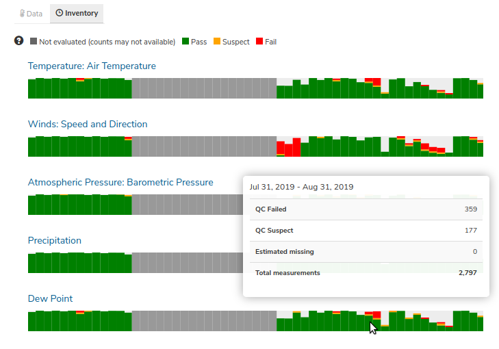
Data quality flags for individual data points can be seen within the data charts. Documentation of the test code and thresholds are linked to under QC information in the lower left of the chart.
Download Data
Data may be downloaded through the data catalog, as described in the Download Data section.
Data Views Overview
You can save a collection of data layers and visualize them together for comparison and analysis. These collections are called data views, and they are accessed by clicking on the views button ![]() in the toolbar along the top of the window.
in the toolbar along the top of the window.
Within the portal there are several pre-made data views that highlight environmental events or locations of interest. You can access these pre-made views from the portal landing page or by clicking on the views button ![]() and selecting a view from the dropdown menu
and selecting a view from the dropdown menu
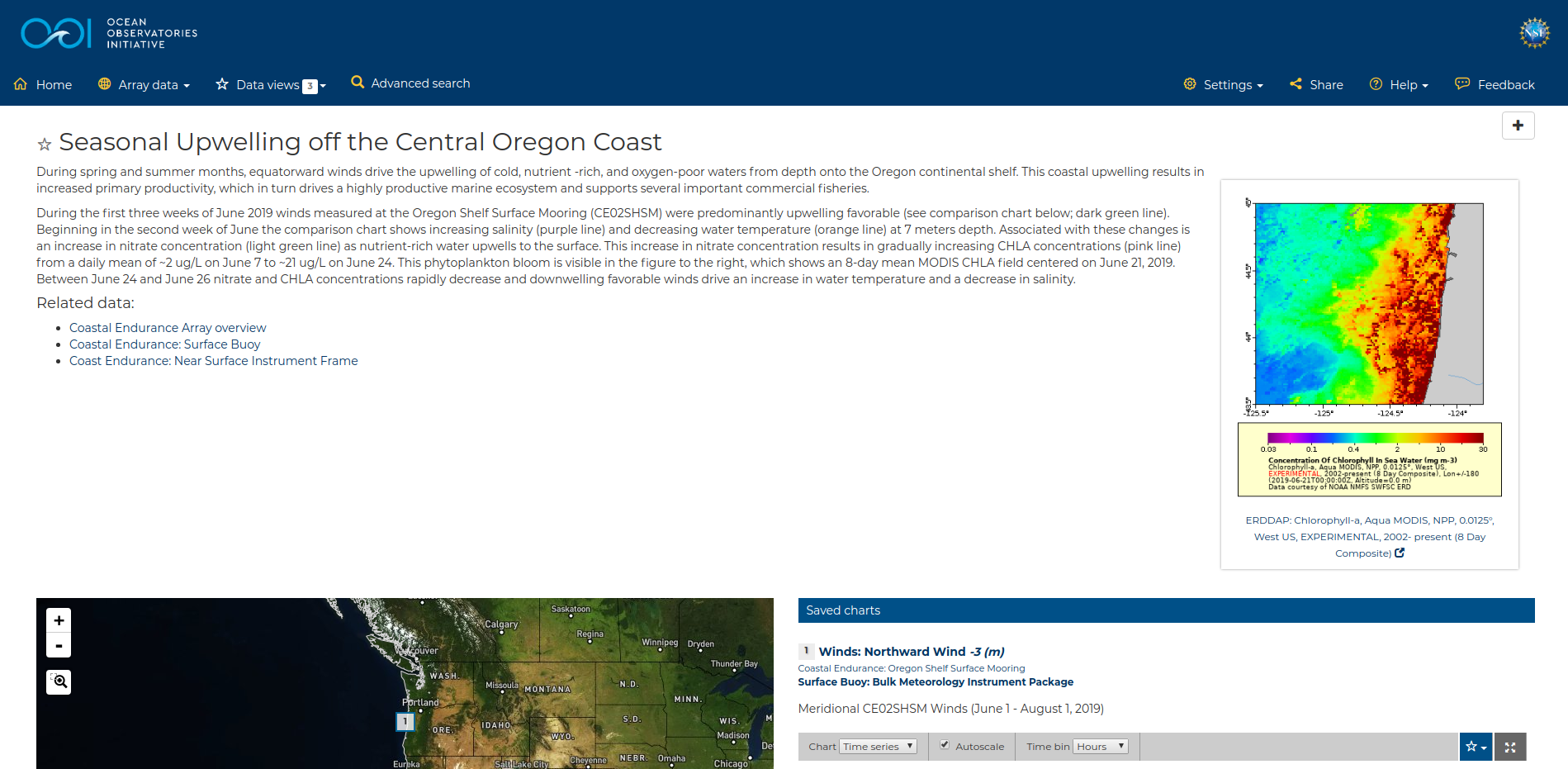
The view will open, displaying data comparison charts for you to explore, as seen in the example below.
Note
If you need assistance creating a particular view, please contact us via the feedback button ![]() in the top right corner of the upper toolbar.
in the top right corner of the upper toolbar.
For more details, please see the Data Views section of the Data Views How-To page.