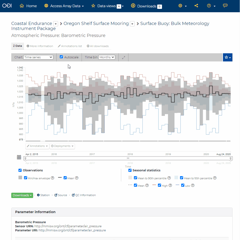
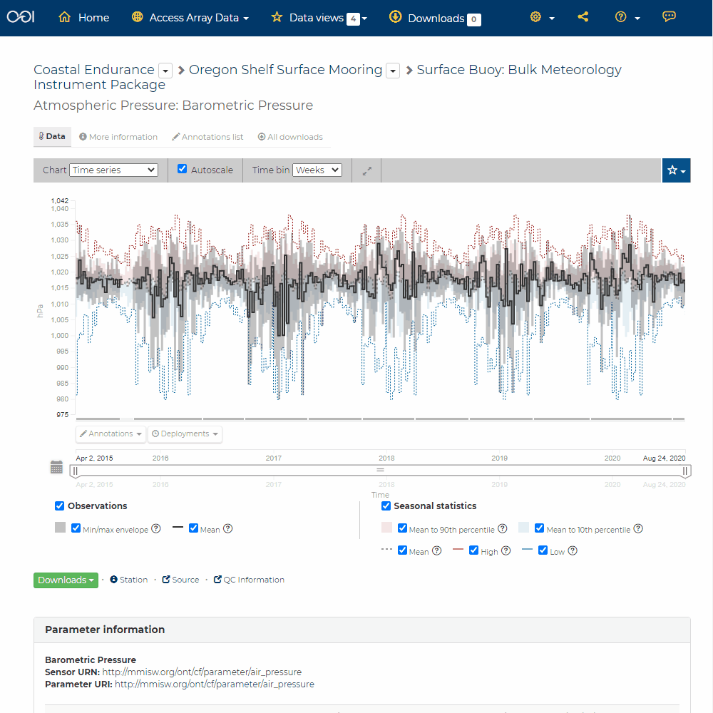
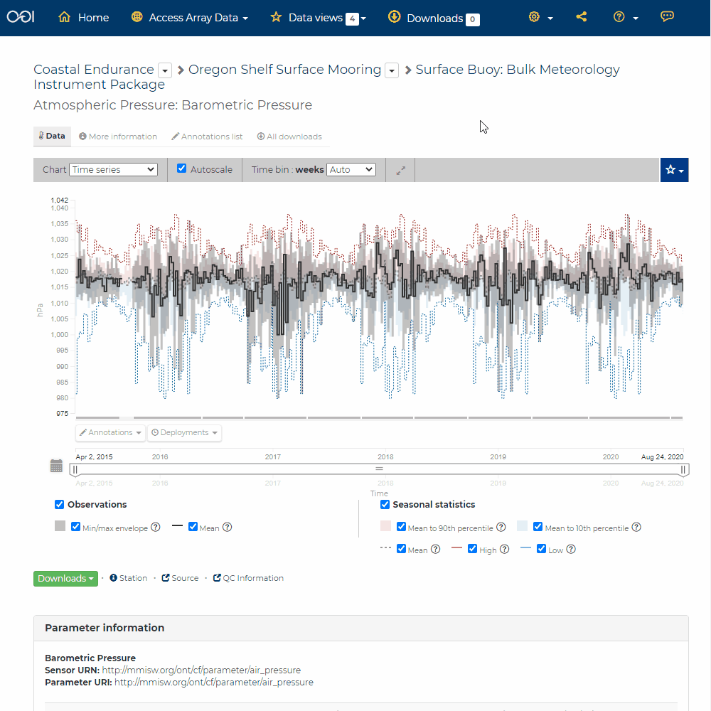
Customize Data Charts
You can adjust the way data are displayed in the chart, including but not limited to the following:
Change the chart type.
Scale the Y-axis (data values).
Scale the X-axis (time).
Re-bin the data.
Display min/max values and/or mean values.
Display data quality flags (when available). Refer to Quality Flags (QARTOD) section.

Additionally, you can explore the selected data more in depth by viewing the station information ![]() , the sensor information
, the sensor information ![]() , or the source information
, or the source information ![]() .
.
For more information about charts, including definitions of many of the terms used here, please see the Data Charts section.